- Mort
- Jan 31, 2020
- 5 min read

At the beginning of this academic year, my tutor and I agreed that I had lost my way somewhere in the second year and needed to return to my roots, regain what I had lost by following the advice of one tutor too closely. Here I will collate experimental, and final works throughout the course of the year in an aim to evaluate and further improve my art.

Both of my tutors (who I will refer to as S and C since this is a public blog and I want to respect their privacy) picked up on this one colour exercise I did during the summer and noted that the expressiveness of the watercolours and line had an energy that my other work lacked. It was this which I was missing throughout most of the second year.
Sticking with the theme of birds, I pursued a project which was an advancement on one that I had researched over summer - my garden birds info zine! S and I discussed anthropomorphising the gardens birds and creating informative comic strips in order to teach my target audience of kids about the birds they would find around them. At the same time, I also wanted to decrease my paper usage as roughing out ideas can quickly lead to single-handed deforestation. So keeping the chickens in mind, I began sketching on the computer!

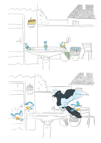
The panel borders are inspired by the work of Lina Eitmantyte-Valuziene. Being digital paintbrush marks, I think it lacks a freer quality, however, I do like how disorderly and broken the panel edges are. The proportion of the magpie to the birdbath is slightly wrong, however I plan to rectify that in future iterations of the piece. The background line is slightly softer trying to take away attention from the background, but with the detail in the door and hanging basket, I still think your eye is drawn away from the birds. I was commended by the tutors in my use of colour palette - something I'm quite pleased about as I had been working on that in second year - and recommended the artist Nicolas Castell by C to further improve my palettes.
Alongside this digital piece, I also developed initial designs for some robin characters - however this time traditionally. The image below is somewhat dull, however, the pigments in the paint are vibrant in actuality (my phone is just bad at taking pictures).

I used this as an opportunity to begin thinking about longer storylines and focussed on the notion of robins being stressed parents as they have multiple broods per season. S much prefered the line quality of my pencils over the digital line and suggested trialling some rougher brushes in Photoshop (which I did later on in an animation). I used heavy blue in the shadows, taking from some advice given by C, which really enriched the shadows and created a sense of depth which I had been lacking while using watercolours. Utilising the erasability of the pencil in order to take away the stress of making mistakes, I made a conscious effort to loosen up with my lines and to not erase even if the lines and shapes weren't as I had imagined. This allowed me to create poses which embodied movement and resulted in characters which were much more fluid than the digital piece. So, are the trees in danger so that I can create better art? Or is my rigid digital style the result of lack of practice?
Around this time, I expressed to S that I felt somewhat stuck on how to progress the project forward as well as developing my style in tandem - it seemed extremely overwhelming at the time - and together we came up with a list of media experiments to execute while working on one composition, but more on that later. We also agreed that pursuing animation in my spare time would be beneficial as it would be an extra skill and something to spice up my portfolio.
In the animation, I used a rougher brush in photoshop, however, I still feel that the line quality is heavy and unexpressive. Could this be because the line is too thick? Or is it simply the best I can achieve on a screen? Only more experimentation can tell. As it was my first animation on photoshop (that is longer than two frames), I struggled with the software and the clumsy manoeuvres needed to switch back and forth between any number of frames (it seems everything is easier traditionally). Perhaps it was due to the particular tutorial I followed, the next time I choose to create an animation I will experiment another way. On a more technical note, I could do with taking time to add more frames in the future as the video plays a little jumpy as it stands, but overall I am pleased with it since it is still early days, and I managed to smash this together in a day's work with references at my side.


I then revisited the magpie composition, reworked the proportions and amended the amount of detail in the background. The line is a 4B pencil scanned in and the levels editted to bring out the black. In the first panel, I used the laso and fill tool to create a block-y shadow in an attempt to break away from the usual way I would draw shadows pictured in the second panel. The second image uses halftones to indicate colour in the birds. I think the pencil line works very well as it gives variation and definition, however,
the crumbly texture of the lead had an adverse effect on my skin so I may have to compromise with a lighter pencil. As much as I had fun messing around with the halftones, I think that black (or in this case grey) and white is not suited to this project as my target audience is children and colour is more appropriate.


Using the same line for the sake of time, I started to experiment with colour and texture. The first image features a monotone palette and the textures alternate between the background and the characters. I think adding texture to the background took away focus from the more important characters, but the alternate textured characters work well, with the added bonus of layer effects it gives them some added depth. The monotone turned out better than I had anticipated, however I may need to be more selective with which objects to colour as they all blend into one level in the background.
I like the duotone of red and green, with the complementary colours, well, complementing each other, however, I think the tritone works better as it added another element that the duotone lacks.

Here, I used two different line brushes, the first panel featuring an ink-esque brush and the second, a pencil one.
While the inky one has variation in it to give a freer feel, the variation repeats - contradicting the purpose of the brush. The pencil one was much nicer to draw with as I could get some variation in width without it looking too digital. The colour here was an experiment in adding touches of colour to the background instead of colour washes. However, I encountered a similar problem to when the line in the background was too busy and the touches of colour took away from the characters. Slapping on the colour to the characters did work rather well, enhancing the looseness of my style.
Reviewing my progress with S, we discussed the possibility that the birdbath wasn't as prominent as it should be, and that the pots in the background were interfering with the magpie's entry. Otherwise, I was to continue as I was and further experiment once I had fixed the compositional issues.
I hope that you find these blogs interesting as there shall be more to come!
Mort.