(A Working List of) Inspirational Artists
- Mort
- Jan 31, 2020
- 4 min read

Updated: Apr 8, 2020
In this post, I'll take a look at the artists that I turn to for inspiration, explain why I admire them and what I hope to learn from their practice.
I've listed them in no particular order. In future updates, the newest ones will be at the top!
New!
Francesca Sanna


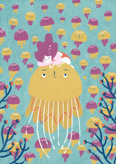
Francesca Sanna is an illustrator and children's book author based in Switzerland, although there seems to be no mention of how she works on her site, it appears to be largely digital. Although Sanna works in flat colour, she utilises simple details and gorgeous colour palettes in order to enrich her use of shapes, truly a splendid artist.
Nicolas Castell


Nicolas Castell was introduced to me by our new tutor before he regrettably left to return to his old job. Again, like many of the artists I'm drawn to, he uses colour very effectively - particularly the colours of his lines. He also works digitally, adding soft texture overlays to offset the flat digital.
Celia Lowenthal


Oh my good gosh where do I start with Celia Lowenthal? Everything about her work is stunning, textures, colour, shadows, composition *chef kiss* She's the type of artist that makes you jump back and forth between the Inspired/Defeated line when researching artists. I love her work so much.
Charlotte Tisdale


Charlotte Tisdale is based in Shrewsbury, which is wild to think I'm only 20 minutes away from where she works, she combines traditional and digital elements to create soft and shapely compositions. I love how seemingly simple her style is.
Dani Diez


Dani Diez is an amazing draftsman and has mastered putting texture into digital art, something that still baffles me. I've learned a lot from looking at his work and hope to continue learning from him. I love the shape variations in his character designs and the bright, vivid colour palettes.
5 Worlds Series

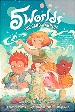


Written by Mark Siegel and Alexis Siegel. Illustrated by Xanthe Bouma, Matt Rockerfeller, and Boya Sun. The Sand Warrior taught me that your style doesn't necessarily have to reflect the tone of your work. While the delicate style fits incredibly well with the peaceful and serene style of the exposition of the story - the city does descend into disrepair and my gosh it was breathtaking to see how they tackled buildings falling in with that style. Colour palettes are also crucial here, leaning into the instinct that redder shades mean danger.
https://twitter.com/marksiegelbooks
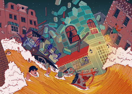
Shaun Tan


Shaun Tan was a lesson in media. While I still haven't been able to find out exactly in which medium he works - I have a hunch that it's oil paints - his illustrations remind me that watercolour isn't the only medium out there. There are plenty of other materials and techniques that I could use. I find the textures in his work the most captivating quality.
Pascal Girard


Pascal Girard is new to my collection of artist inspirations, I picked up Petty Theft in Lambiek and it was very refreshing to enjoy someone with a looser style - having a loose style myself. The absence of panel boarders also gave the book a more fluid feel to it, so possibly something that I'm going to try in the future.
Mucha


I find Mucha's work extremely captivating. There's something in the use of colour, composition, and detail that I just can't get enough of. The thick outline juxtaposing the photo-realistic faces gives his work a nudge towards the uncanny valley, however it's not far enough in that direction to have an adverse effect on the likability of the art. Symmetry is also evident here and can be used as a powerful compositional tool.
Maybe I should look into more Art Nouveau practitioners...
Lily Rowles


Lily Rowles is an artist I discovered during my time at college. Her loose style and use of watercolours and inks is something that I keep coming back to. Her use of complimentary colours in the two pieces above are particularly striking.
These next artists are taken from a book on Lithuanian illustration, can I pronounce any of there names? No, no I can't.
Vaidas Zvurblis


I'm drawn to the use of line and colour here. When creating art, I tend to lean towards muted colours, meaning that my images are often flat in the rough states before I brighten everything up, Zvurblis makes the muted colours work for him - possibly helped by the use of complimentary colours and the mark making.
Lina Eitmantyte-Valuziene


While Eitmantyte's drafting skills are exceptional, I am looking at the backgrounds here. The shapes that the watercolour washes make are very textural, and set the mood for the compositions with the colours used, would something like this work well as a panel in a comic? Who knows. Time to experiment, I guesss.
Rimvydas Kepezinskas


Kepezinskas is an excellent example of mixed media working in harmony, it took me an exceptionally long time to notice that he had used embroidered lines over the watercolours. Speaking of which, the paint is used in an incredibly expressive way requiring skillful control over the pigments and water. Oof goals
Sarunas Leonavicius


Something akin to tapestries! I love the use of negative space choosing where not to draw is a very important part of Leonavicius' process, something which I should keep in mind more readily. It could lead to stronger compositions!
Jurga Sarmaviciute


The subtle use of textures, colour, and blatantly impossible anatomy lend Sarmaviciute's illustrations a playful quality that I'd love to explore more. She manages to use photographed textrures very effectively, possibly having something to do with the limited palette.
Ula Simulynaite


I love the crude style here. The line quality giving the illustrations a fresh feel as if Simulynaite had just finished drawing them. She also has a delicate use of colour and a slightly skewed perspective also feeding into the freshness.


Comments