top of page
  • Writer: Mort
    Mort
  • Jan 31, 2020
  • 1 min read

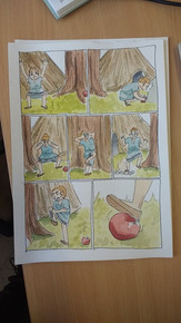
Here's a quick little comic I drew. Does anyone else find it incomprehensible at our use of plastic?

Seriously, our use of plastic really concerns me

I try my best to buy as many things (vegetables in particular) loose. I just really don't see any benefit to the plastic wrap. It's something that you're only going to use to carry the food to your house, and unless you're going to deliberately drop it onto the ground and smother it all over the bacteria on the floor, then you really don't need plastic wrap on most things.


I hope the plastic bothers you too,


See you next time,


Mort


Updated: Apr 8, 2020

In this post, I'll take a look at the artists that I turn to for inspiration, explain why I admire them and what I hope to learn from their practice.

I've listed them in no particular order. In future updates, the newest ones will be at the top!


New!

Francesca Sanna

Francesca Sanna is an illustrator and children's book author based in Switzerland, although there seems to be no mention of how she works on her site, it appears to be largely digital. Although Sanna works in flat colour, she utilises simple details and gorgeous colour palettes in order to enrich her use of shapes, truly a splendid artist.


Nicolas Castell

Nicolas Castell was introduced to me by our new tutor before he regrettably left to return to his old job. Again, like many of the artists I'm drawn to, he uses colour very effectively - particularly the colours of his lines. He also works digitally, adding soft texture overlays to offset the flat digital.


Celia Lowenthal

Oh my good gosh where do I start with Celia Lowenthal? Everything about her work is stunning, textures, colour, shadows, composition *chef kiss* She's the type of artist that makes you jump back and forth between the Inspired/Defeated line when researching artists. I love her work so much.


Charlotte Tisdale

Charlotte Tisdale is based in Shrewsbury, which is wild to think I'm only 20 minutes away from where she works, she combines traditional and digital elements to create soft and shapely compositions. I love how seemingly simple her style is.


Dani Diez

Dani Diez is an amazing draftsman and has mastered putting texture into digital art, something that still baffles me. I've learned a lot from looking at his work and hope to continue learning from him. I love the shape variations in his character designs and the bright, vivid colour palettes.


5 Worlds Series

Written by Mark Siegel and Alexis Siegel. Illustrated by Xanthe Bouma, Matt Rockerfeller, and Boya Sun. The Sand Warrior taught me that your style doesn't necessarily have to reflect the tone of your work. While the delicate style fits incredibly well with the peaceful and serene style of the exposition of the story - the city does descend into disrepair and my gosh it was breathtaking to see how they tackled buildings falling in with that style. Colour palettes are also crucial here, leaning into the instinct that redder shades mean danger.


https://twitter.com/marksiegelbooks


Shaun Tan

Shaun Tan was a lesson in media. While I still haven't been able to find out exactly in which medium he works - I have a hunch that it's oil paints - his illustrations remind me that watercolour isn't the only medium out there. There are plenty of other materials and techniques that I could use. I find the textures in his work the most captivating quality.


Pascal Girard

Pascal Girard is new to my collection of artist inspirations, I picked up Petty Theft in Lambiek and it was very refreshing to enjoy someone with a looser style - having a loose style myself. The absence of panel boarders also gave the book a more fluid feel to it, so possibly something that I'm going to try in the future.


Mucha

I find Mucha's work extremely captivating. There's something in the use of colour, composition, and detail that I just can't get enough of. The thick outline juxtaposing the photo-realistic faces gives his work a nudge towards the uncanny valley, however it's not far enough in that direction to have an adverse effect on the likability of the art. Symmetry is also evident here and can be used as a powerful compositional tool.

Maybe I should look into more Art Nouveau practitioners...


Lily Rowles

Lily Rowles is an artist I discovered during my time at college. Her loose style and use of watercolours and inks is something that I keep coming back to. Her use of complimentary colours in the two pieces above are particularly striking.


These next artists are taken from a book on Lithuanian illustration, can I pronounce any of there names? No, no I can't.


Vaidas Zvurblis

I'm drawn to the use of line and colour here. When creating art, I tend to lean towards muted colours, meaning that my images are often flat in the rough states before I brighten everything up, Zvurblis makes the muted colours work for him - possibly helped by the use of complimentary colours and the mark making.


Lina Eitmantyte-Valuziene

While Eitmantyte's drafting skills are exceptional, I am looking at the backgrounds here. The shapes that the watercolour washes make are very textural, and set the mood for the compositions with the colours used, would something like this work well as a panel in a comic? Who knows. Time to experiment, I guesss.


Rimvydas Kepezinskas

Kepezinskas is an excellent example of mixed media working in harmony, it took me an exceptionally long time to notice that he had used embroidered lines over the watercolours. Speaking of which, the paint is used in an incredibly expressive way requiring skillful control over the pigments and water. Oof goals


Sarunas Leonavicius

Something akin to tapestries! I love the use of negative space choosing where not to draw is a very important part of Leonavicius' process, something which I should keep in mind more readily. It could lead to stronger compositions!


Jurga Sarmaviciute

The subtle use of textures, colour, and blatantly impossible anatomy lend Sarmaviciute's illustrations a playful quality that I'd love to explore more. She manages to use photographed textrures very effectively, possibly having something to do with the limited palette.


Ula Simulynaite

I love the crude style here. The line quality giving the illustrations a fresh feel as if Simulynaite had just finished drawing them. She also has a delicate use of colour and a slightly skewed perspective also feeding into the freshness.


  • Writer: Mort
    Mort
  • Jan 31, 2020
  • 3 min read

In this post I'll go through the process of making the comic I produced while in Leiden.

One of the more difficult things (for me anyway) is to come up with a concise enough story which doesn't turn into a 300 page epic that I have no hope of finishing. In this instance, that rocky path was curbed by two things: the time constraint of having only two and a half days worth of drawing, and the task at hand.


We each picked a museum at random and were sent to find one object that resonated with us. It was this object that we would create a story from, linking it somehow to the future in the process.


Naturally, out of all of the elegant, ancient and beautifully crafted items in the Oudheden, I pick a bashed up skeleton.


It was tucked away behind this slick and modern looking display wall, kind of as an afterthought to the rest of the iron age exhibit. Granted, when I first saw it I was still thinking about the Egyptian hieroglyphs and Roman statues, but over lunch in the museum it was this photo that got my brain working.


I began with a mind map, coming up with ways (rather morbidly) in which this poor soul had died all those thousands of years ago. It occurred to me that the story could literally take any shape, and so, to navigate away from the grim nature of the skeleton, I knew I wanted it to be funny.


The evening before, the tutors had mentioned that there should be a minimum of 5 pages. Keeping that in mind, I began planning out 6-7 pages trying to stretch out the story. However, as the sketching progressed, I realised that the story fits neatly into the 5.


Character design was very hasty. The initial roughs had no research behind them and the tutors picked up on that, having had a disapproving look cast my way I did some quick research into the iron age. To my relief, I was already rather familiar with their environment and attire (having come from a place with strong Celtic ties) and could quickly sketch out some more informed designs.

Now was just a case of scaling the story up to A5 and watercolouring it. At least, that was my plan. No sooner had I drawn out all the panels ready to be rendered, did my tutor peer over my shoulder and advise me to change the margins and panel layout!


It was no problem though, it meant a trip to the art shop and boy that was fun! They had everything any artist could possibly dream of. With my new A4 sketchbook, I repeated the process of drawing the panels and set to work drawing out the story.


Once that was all taken care of it was just a matter of slapping on some colour and BAM! ready for digitising and small edits. The edits are still taking place, and a title is still being mulled over, but isn't it amazing what you can achieve if you're pushed for time and have no internet access!


I hope you found this interesting! I will include photos of the uneditted, 'raw' images that I actually produced on the boat, below. There is one panel that needed redrawing which will be dropped onto the page in photoshop, so don't be confused by the rogue panel which has a page to itself.


See you again,


Mort


© 2020 by Codi Mortimer. Begrudgingly created with Wix.com.

  • Twitter
  • Instagram
  • Facebook
bottom of page