top of page

Since the last evaluative post, I've almost finished the robin comic... more than once. I'll share my process of creating finished artwork with you.

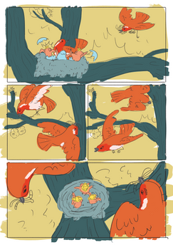
Once all of the backgrounds were painted, I didn't hesitate to scan them in at a ridiculous resolution and drop them into my photoshop documents. For a reminder, this is how they looked in the last post. --->

I then flat coloured all of the robins, this included a base layer onto which any markings or accents were clipped. I was quite happy with this as it saved time in the long run, and I was ready to put the textures in.

Adding the textures involved utilising the blend modes in Photoshop. I found that dropping in the watercolour textures created a depth to the characters that I wouldn't have executed well using only traditional techniques.

Once I had reached this stage, I brought the work to S, thinking I was finished. However, I was not. S thought that the tree bark was too dark and thus distracting the viewer from the characters. Once this was pointed out, I realised that S was right (S is right all of the time, it's an illustration rule). And so, instead of repainting everything, I turned to the hue/saturation tool. Finally, now, I was finished.

Nope.

We discussed the texture in the background. Even though I had layered on the colours while the paint was wet, it had bled into itself while it was drying and had lost a lot of its tonal contrast. To combat this, I repainted a texture and used the select tool in tandem with the hue/saturation tool. Once I had finished this, I was convinced that I could lay the robins to rest, however, I was wrong again! The line was being lost in the busy-ness of the page and so I selected the line, expanded the selection and filled. It kept the roughness of the brush that I had used, which I was very relieved about, otherwise, I would have had to redraw all ten pages (which wouldn't be the end of the world, however, this close to our deadline I wanted to spend more time on other things). And there, I was finally finished. I have learnt a lot through this project, negative space being the primary learning outcome, but I've also grown more familiar with Photoshop, its brushes, and its ability to save my skin in a tough situation! But this isn't the only project I've been working on.

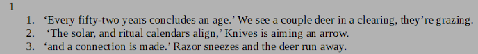
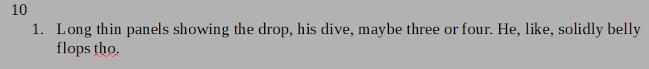
I've been thinking about the storyline for my extra project (soon to be my major project in the next semester whoop!) and pulled together my research. While I'm not going to leave you with reams of screen-shots of word documents, I will leave you with these snippets.

See you next time,

Mort


This weekend (the 9th and 10th of November) I was extremely lucky. Two of my good friends were tabling at Thought Bubble and found that they had an extra bed in their hotel room, and so I tagged along! Here I will record what I've learnt through this wonderful experience, and what I plan for the future.

I don't have very many left now!

As an effort to be a little more memorable than the general public, I attempted to strike up a conversation with anyone I wanted to buy something from, and to also give them a sticker as a way of bringing myself to the forefront of their minds every time they see it.

I'd had the stickers themselves for almost two years now and thought that this was the perfect opportunity to use them.

I had the pleasure of meeting past students of Glyndwr university and their friends, and observing how they're progressing with their careers. It was also very handy to have social media as I could sneak away with images of their stalls without physically taking any photos.

(The photos above do not belong to me) It was very reassuring to see the range of stalls at the convention. Some people featured zines, badges, stickers and posters, while some other people also had bigger books thrown in. People who had banners with their ocs or artwork on really caught my eye, however, there were some very colourful table cloths and very many pride flags mixed in which also caught my eye. I found that people who had boards of prices were often asked how much things were, whereas individually labelled things worked better in the chaos of wandering crowds - but beware that the price tags move! Almost everyone had a business card that they slipped into purchases.

Planning for the future, I would like to have a range of items for sale. I'd like to primarily have zines or comics for my first table, I know that stickers are not hard to make or purchase and if I can set aside time to create stand-alone images in amongst my work at uni, I don't see why I can't be ready for a convention very soon.

Banners are something that I'd like to look into, I know that my style and quality of work is improving very fast at the moment, however, the striking nature of the banner would be worth the cost at the beginning, bringing people in towards me against others who may not have banners. A quick search found that a banner from helloprint.co.uk was £31 - so well within my grasp.

While there, I was also introduced to a couple of new publishing houses that I'd not heard of previously, ShortBox, and Avery Hill Publishing. I'm unsure as to whether they would benefit me if I approached them, it's something to look into in the future and also worth my time to watch them on social media.

I've also done some quick research into dates of conventions and events (Assuming they're all around the same time each year). Obviously, there's Thought Bubble which took place on the 9-10th of this month. MCM Manchester was in July, MCM Scotland in September, London - October, and Birmingham in November. There's a Zine festival in South London in August, Shake Bristol on December 8th and Wales Comiccon (Now in Telford, England??) also in December. I'm sure a more thorough search would produce even more events, but this is a good starting point.

The future looks exciting!

See you next time,

Mort.


The artists and stalls featured here (from left to right) are Tuisku, Caitlyn, Lea, Kip, Alex, George, Lucy, Rosie, and Eve


  • Writer: Mort
    Mort
  • Jan 31, 2020
  • 2 min read

I sent my robin silhouettes to S, and while I waited I cracked my knuckles and started my exciting extra project!! I bring to you, the loosest silhouettes ever. Designed to stop myself from being too precious as this project means a lot to me. Those of you who also follow me on Pinterest will have seen the amount of Mayan/Aztec clothing I've been pinning lately.

My plan with these was to get the basic shape down, trying to vary the proportions to create a simple, but distinctive rough. Using a technique I picked up from a tutor on a different course, I scanned them into photoshop and used the liquify filter to move some parts around before I worked into them using a light grey brush. This process took a lot more time than I anticipated, but I think the end results are much more interesting than if I had have drawn them my usual way.

S got back to me about the robin silhouettes, and while I had resolved some of the issues, I had missed the overall point of the exercise - making the negative space more interesting. So, S explained how I could improve and so I went back to drawing, and after some subtler edits, I landed on the final roughs.

From here, I was able to finalise the linework and move onto preparing watercolour paper and colours.

The first image is my default orange and blue combination, which I do really like, however, it's very autumny which would be the wrong time of year for the setting, and so the blue and pink combination came about. This was an attempt at using unconventional colours while still portraying the identity of a robin well. The third rough leaned more towards the realistic colours while still paying homage to complementary colours. Finally, with some input from S, I came to the final image which combined elements from all three.

I was unsure as to how the colours would translate in watercolour as viewing colours on a digital screen is much different from mixing colours on absorbent paper and so, as I finished the background of the first page, I quickly scanned it in and made a sample of how the colours would turn out.

The first page will be the coldest, as robins begin building nests as winter turns to spring and as the story progresses, the greens will become warmer, reflecting the colour roughs more closely.

Now all that's left to do is complete the rest of the backgrounds and create some textures to lift onto the robins.

Exciting times!

See you next time,

Mort.


© 2020 by Codi Mortimer. Begrudgingly created with Wix.com.

  • Twitter
  • Instagram
  • Facebook
bottom of page